Infographic Analysis - Federalists and Anti-federalists
Infographics are an easy to make supplementary material that allow students to extend their learning and understanding of topics and materials at hand in an easy to read and fun method. Proper infographics include visual representations of information that are easy for students to understand as well as simple text that can help push the learner further in their understanding of the topic. Students of all ages can benefit from infographics and teachers should always use this simple material to their advantage whenever possible.
The target audience for this infographic would be eleventh grade transitioning and expanding ENL students as well as the rest of the general population of the eleventh grade students. Students would access this infographic in their United States History class. Although this infographic can be used in a seventh grade history class (the topic is discussed in both seventh and eleventh grade) I designed the infographic towards the higher grades which allowed me to use more topic specific vocabulary in the infographic so students can practice and revisit specific words in a context that is easy to understand. Although seventh graders need to learn the same topic, it is typically simplified at that grade level, and is only visited briefly. However, eleventh grade students will spend more time discussing the topic and this topic is typically seen on the eleventh grade regents. That being said, I feel this infographic would better suit the older students both cognitively and academically.
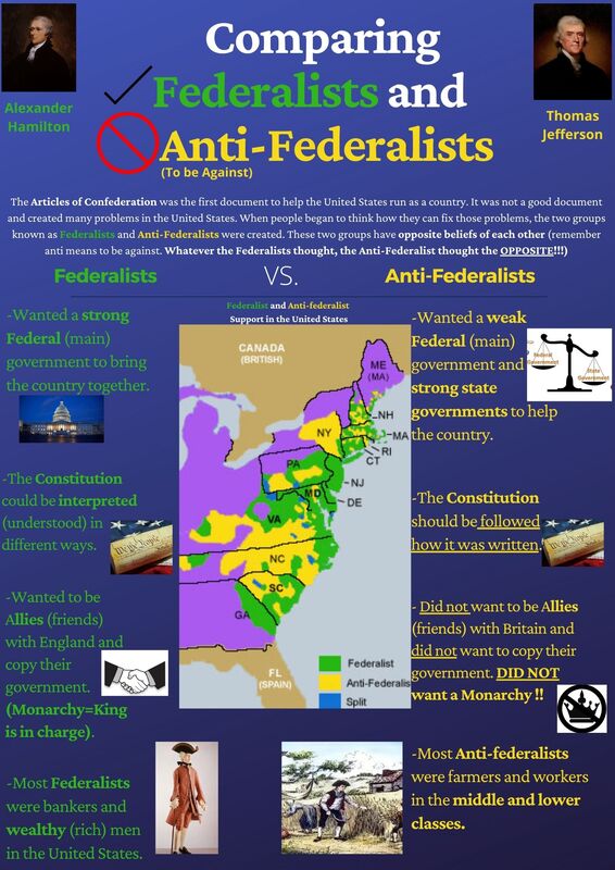
The topic of this infographic is comparing the Federalists and Anti-Federalist point of views and their locations of support in the United States. Students will focus primarily on different primary sources, like the Federalist Papers during this unit of study. It is imperative for students to understand the difference between the two groups before going into the sources themselves and identifying and analysing what they are trying to say in their writing. There are a couple of learning outcomes that come along with this infographic. First and foremost, students will be able to identify the different viewpoints of Federalists and Anti-federalists. Second, students will be able to locate areas that support the two sides in the United States. Students will also be able to explain why certain areas supported one side of the over the other. Finally, students will be able to apply the definition of the prefix anti to opposing point of views the Federalists held. This infographic covers both content and language objectives within it. There is ample amount of content and information located on the infographic to begin with. However, the students can advance their thinking to the next level and beyond what is on the infographic when they grasp the concept that the Anti-federalists held opposite views than the Federalists. This is clearly explained in the infographic and can easily be used to describe how the Anti-federalists would feel about a certain topic when students read The Federalist Papers. These ideas can be transferred to the following topic, which is reading The Anti-federalist Papers. Using what is on the infographic and the first reading, students can immediately hypothesize and infer what the beliefs of the Anti-federalists are by understanding the prefix anti, which is explained on the infographic with examples on the infographic, and using the viewpoints of the Federalists as a starting ground (whatever the Federalists think, Anti-federalists think opposite).
The infographic I created is a comparison chart pertaining to the Federalists and Anti-federalists in the United States towards the end of the eighteenth century. When creating the infographic, I tried to keep the colors coordinated with the two sides I was discussing. The text, names of people, and groups, coincide with the map of the support of these two sides found in the middle of the infographic. Even though students may get confused on some information, they can still follow who believed what through the color coding I implemented in the infographic. Color coding has been proven to be an extremely effective study aid for students, as it breaks down and categorizes materials for students to easily recognize. Also, when it comes to mastering a new language, color coding materials help students learn and retain new important vocabulary in that language (Color-Coding, 2013). Color coding the vocabulary allows students to better understand similar vocabulary as well as differentiate other groups of vocabulary words. As in my infographic, vocabulary words and content that relate to the specific main vocabulary words students are looking at are consistent specific colors, which allows them to better retain which words and concepts belong to which group. Black and white for an entire infographic would be useless because it may seem like just a bunch of random words that are not easily seen as relating to one another according to students, especially ENL students. With color coding vocabulary and concepts, students can follow the infographic and understand which group each part of the graphic belongs to. I used a simple, easy to read font at a large enough scale that students do not have to get too close to read the information. When it is printed and placed on a wall, it will be scaled greatly in size, which will make all the images and words pop out even more. When stating information on the infographic, I tried my best to keep the essential vocabulary intact while giving a synonym or example, whether it is a word or an image, to help the students understand what is being discussed. Again, since this pertains to understanding Federalists, Anti-federalists, and the meaning of the prefix anti, I bolded and underlined words that will help show how these two groups are opposites through their beliefs and ideas. Social Studies has a lot of complicated words and you cannot simply omit them from subject because then the content becomes fuzzy and difficult to understand. The best method is to think of examples or similes that students may already know, while keeping the content vocabulary word there for students to see, use, and eventually master. I try to use images that will come up in the lessons about these groups to hopefully allow students to recall back to our activities and discussions in class when looking at the infographic. I included images that pertain to each different point between the two groups. Using visual aides in a classroom, especially with ENL students is essential because it gives students the ability to “link words with their meanings” (Hawlani, 2017, p. 53). Social Studies can have many abstract or difficult content vocabulary words and concepts, especially as the year progresses. It is important for a teacher to find easy to understand visuals that allow students to take these difficult words and possibly create a simplified definition they can understand and think of whenever they see the image. For example, when I discuss the Anti-federalist beliefs on the federal government, I used a picture of a scale that shows the states rights weighing more than the federal government. Students will come across these kinds of scales in different classes, so they might have an easier time comprehending that Anti-Federalists thought states rights were more important than federal rights (on top of the understanding of the prefix Anti). I also used a clear and easy to understand map that has a clear key to indicate what the colors are representing, which also correlate with the text and the key content vocabulary words being analyzed. This map not only gives information of locations of support, but opens up the students to higher order thinking. For example, when you know which groups of people believed in which government system, you can easily correlate their locations to what they support. We see more support for federalists where people tend to be more wealthy and support for the opposite in poorer more rural areas. Students can make these easy connections with guidance and little direction from the teacher. Overall, the graphics, text, and colors of the infographic make it easy to follow and understand for all students in an eleventh grade classroom.
This topic is relevant to learners in an eleventh grade Social Studies classroom in many ways. First, it is part of the Social Studies framework objectives stated by New York State. “Students will examine the key points of debate expressed in the Federalist Papers and the Antifederalist Papers, focusing on the protection of individual rights and the proper size for a republic” (Social Studies Framework, 2015 p. 35). Federalists and Anti-federalists are an integral part of the foundation of the Constitution we have today, and this document would be drastically different if one or both parties never existed. This topic also comes up frequently on the United States History Regents Exam, which is necessary to pass in order to receive a diploma and graduate from high school. Also, as much as we talk about opposing groups in Social Studies, this is the first example of people with direct opposite views of one another within the United States. It opens eyes up to the reality that people will always have different opinions on hot topics in our society. This topic also allows all students to examine their beliefs and argue which side they would agree with and why, which could spark very in depth and informative debates about people's beliefs, past experiences, and prior knowledge on the subject at hand or topics they learned in the past. In order to make this infographic easy to understand with difficult concepts, I kept it in a bullet point format. The four main bullets pertain to the same topics for both sides (i.e. British relations, Role of federal government, interpretation of Constitution, makeup of party members). This gives students the opportunity to compare one group to the other simply by reading from left to right. The ideas are lined up in order to make it easier for the students to compare the points of view.
I have created a few infographics for this program in previous classes. I always have a great time making them both academically and visually appealing for all students. However, as I have noticed, secondary education students deal with a lot more concepts that are abstract and difficult to understand at a much faster rate than students in elementary grades. I try my best to keep the information to a minimum, only hitting the points necessary, however it still feels like a lot of information from time to time. To me, this infographic seems clear and concise, however, I fear for ENL students it may be a bit too much for them to process (by this I mean too many images on the page. The content that is there is the BARE MINIMUM required to understand the topic at hand). Although there seems to be much going on, when it is explained by the teacher, it is easily understood what belongs to where and how to understand what concepts go with which group (I refer back to the color coding in my previous paragraphs). A possible remedy for this feeling would be to create two separate infographics for each group, however, for an assignment like this, it makes sense to incorporate both into one infographic so I may stress the linguistic importance of the prefix “Anti”. I do notice that my infographic creating skills have gotten better over time and I have been able to create clearer products. The one issue I will always have is matching colors to other pictures (yes, I am colorblind so I apologize if the colors do not match exactly). Looking at infographics from a teacher's point of view, they allow me to think of what really is the most important parts of a topic and put them in a way that is easy to understand and visually pleasing. It also allows me to think about what I really want students to get out of a topic and possibly the points I would like to assess in the future. Finally these infographics allow me to look at a topic and move students from thinking factually to thinning analytically and synthesize the information to use it in a new context or a question that will force them to think outside the box a bit more. I look forward to implementing these into my classroom when I become a full time head teacher.
References
Effectiviology. (2013). Retrieved March 5, 2021, from https://effectiviology.com/color-coding-techniques-vocabulary-learning/
Halwani, N. (2017). Visual AIDS and multimedia in second language acquisition. English Language Teaching, 10(6), 53. doi:10.5539/elt.v10n6p53
New York State Grades 9-12 Social Studies Framework. (2015). Retrieved March 4, 2021, from http://www.nysed.gov/common/nysed/files/programs/curriculum-instruction/ss-framework-9-12.pdf
Infographics are an easy to make supplementary material that allow students to extend their learning and understanding of topics and materials at hand in an easy to read and fun method. Proper infographics include visual representations of information that are easy for students to understand as well as simple text that can help push the learner further in their understanding of the topic. Students of all ages can benefit from infographics and teachers should always use this simple material to their advantage whenever possible.
The target audience for this infographic would be eleventh grade transitioning and expanding ENL students as well as the rest of the general population of the eleventh grade students. Students would access this infographic in their United States History class. Although this infographic can be used in a seventh grade history class (the topic is discussed in both seventh and eleventh grade) I designed the infographic towards the higher grades which allowed me to use more topic specific vocabulary in the infographic so students can practice and revisit specific words in a context that is easy to understand. Although seventh graders need to learn the same topic, it is typically simplified at that grade level, and is only visited briefly. However, eleventh grade students will spend more time discussing the topic and this topic is typically seen on the eleventh grade regents. That being said, I feel this infographic would better suit the older students both cognitively and academically.
The topic of this infographic is comparing the Federalists and Anti-Federalist point of views and their locations of support in the United States. Students will focus primarily on different primary sources, like the Federalist Papers during this unit of study. It is imperative for students to understand the difference between the two groups before going into the sources themselves and identifying and analysing what they are trying to say in their writing. There are a couple of learning outcomes that come along with this infographic. First and foremost, students will be able to identify the different viewpoints of Federalists and Anti-federalists. Second, students will be able to locate areas that support the two sides in the United States. Students will also be able to explain why certain areas supported one side of the over the other. Finally, students will be able to apply the definition of the prefix anti to opposing point of views the Federalists held. This infographic covers both content and language objectives within it. There is ample amount of content and information located on the infographic to begin with. However, the students can advance their thinking to the next level and beyond what is on the infographic when they grasp the concept that the Anti-federalists held opposite views than the Federalists. This is clearly explained in the infographic and can easily be used to describe how the Anti-federalists would feel about a certain topic when students read The Federalist Papers. These ideas can be transferred to the following topic, which is reading The Anti-federalist Papers. Using what is on the infographic and the first reading, students can immediately hypothesize and infer what the beliefs of the Anti-federalists are by understanding the prefix anti, which is explained on the infographic with examples on the infographic, and using the viewpoints of the Federalists as a starting ground (whatever the Federalists think, Anti-federalists think opposite).
The infographic I created is a comparison chart pertaining to the Federalists and Anti-federalists in the United States towards the end of the eighteenth century. When creating the infographic, I tried to keep the colors coordinated with the two sides I was discussing. The text, names of people, and groups, coincide with the map of the support of these two sides found in the middle of the infographic. Even though students may get confused on some information, they can still follow who believed what through the color coding I implemented in the infographic. Color coding has been proven to be an extremely effective study aid for students, as it breaks down and categorizes materials for students to easily recognize. Also, when it comes to mastering a new language, color coding materials help students learn and retain new important vocabulary in that language (Color-Coding, 2013). Color coding the vocabulary allows students to better understand similar vocabulary as well as differentiate other groups of vocabulary words. As in my infographic, vocabulary words and content that relate to the specific main vocabulary words students are looking at are consistent specific colors, which allows them to better retain which words and concepts belong to which group. Black and white for an entire infographic would be useless because it may seem like just a bunch of random words that are not easily seen as relating to one another according to students, especially ENL students. With color coding vocabulary and concepts, students can follow the infographic and understand which group each part of the graphic belongs to. I used a simple, easy to read font at a large enough scale that students do not have to get too close to read the information. When it is printed and placed on a wall, it will be scaled greatly in size, which will make all the images and words pop out even more. When stating information on the infographic, I tried my best to keep the essential vocabulary intact while giving a synonym or example, whether it is a word or an image, to help the students understand what is being discussed. Again, since this pertains to understanding Federalists, Anti-federalists, and the meaning of the prefix anti, I bolded and underlined words that will help show how these two groups are opposites through their beliefs and ideas. Social Studies has a lot of complicated words and you cannot simply omit them from subject because then the content becomes fuzzy and difficult to understand. The best method is to think of examples or similes that students may already know, while keeping the content vocabulary word there for students to see, use, and eventually master. I try to use images that will come up in the lessons about these groups to hopefully allow students to recall back to our activities and discussions in class when looking at the infographic. I included images that pertain to each different point between the two groups. Using visual aides in a classroom, especially with ENL students is essential because it gives students the ability to “link words with their meanings” (Hawlani, 2017, p. 53). Social Studies can have many abstract or difficult content vocabulary words and concepts, especially as the year progresses. It is important for a teacher to find easy to understand visuals that allow students to take these difficult words and possibly create a simplified definition they can understand and think of whenever they see the image. For example, when I discuss the Anti-federalist beliefs on the federal government, I used a picture of a scale that shows the states rights weighing more than the federal government. Students will come across these kinds of scales in different classes, so they might have an easier time comprehending that Anti-Federalists thought states rights were more important than federal rights (on top of the understanding of the prefix Anti). I also used a clear and easy to understand map that has a clear key to indicate what the colors are representing, which also correlate with the text and the key content vocabulary words being analyzed. This map not only gives information of locations of support, but opens up the students to higher order thinking. For example, when you know which groups of people believed in which government system, you can easily correlate their locations to what they support. We see more support for federalists where people tend to be more wealthy and support for the opposite in poorer more rural areas. Students can make these easy connections with guidance and little direction from the teacher. Overall, the graphics, text, and colors of the infographic make it easy to follow and understand for all students in an eleventh grade classroom.
This topic is relevant to learners in an eleventh grade Social Studies classroom in many ways. First, it is part of the Social Studies framework objectives stated by New York State. “Students will examine the key points of debate expressed in the Federalist Papers and the Antifederalist Papers, focusing on the protection of individual rights and the proper size for a republic” (Social Studies Framework, 2015 p. 35). Federalists and Anti-federalists are an integral part of the foundation of the Constitution we have today, and this document would be drastically different if one or both parties never existed. This topic also comes up frequently on the United States History Regents Exam, which is necessary to pass in order to receive a diploma and graduate from high school. Also, as much as we talk about opposing groups in Social Studies, this is the first example of people with direct opposite views of one another within the United States. It opens eyes up to the reality that people will always have different opinions on hot topics in our society. This topic also allows all students to examine their beliefs and argue which side they would agree with and why, which could spark very in depth and informative debates about people's beliefs, past experiences, and prior knowledge on the subject at hand or topics they learned in the past. In order to make this infographic easy to understand with difficult concepts, I kept it in a bullet point format. The four main bullets pertain to the same topics for both sides (i.e. British relations, Role of federal government, interpretation of Constitution, makeup of party members). This gives students the opportunity to compare one group to the other simply by reading from left to right. The ideas are lined up in order to make it easier for the students to compare the points of view.
I have created a few infographics for this program in previous classes. I always have a great time making them both academically and visually appealing for all students. However, as I have noticed, secondary education students deal with a lot more concepts that are abstract and difficult to understand at a much faster rate than students in elementary grades. I try my best to keep the information to a minimum, only hitting the points necessary, however it still feels like a lot of information from time to time. To me, this infographic seems clear and concise, however, I fear for ENL students it may be a bit too much for them to process (by this I mean too many images on the page. The content that is there is the BARE MINIMUM required to understand the topic at hand). Although there seems to be much going on, when it is explained by the teacher, it is easily understood what belongs to where and how to understand what concepts go with which group (I refer back to the color coding in my previous paragraphs). A possible remedy for this feeling would be to create two separate infographics for each group, however, for an assignment like this, it makes sense to incorporate both into one infographic so I may stress the linguistic importance of the prefix “Anti”. I do notice that my infographic creating skills have gotten better over time and I have been able to create clearer products. The one issue I will always have is matching colors to other pictures (yes, I am colorblind so I apologize if the colors do not match exactly). Looking at infographics from a teacher's point of view, they allow me to think of what really is the most important parts of a topic and put them in a way that is easy to understand and visually pleasing. It also allows me to think about what I really want students to get out of a topic and possibly the points I would like to assess in the future. Finally these infographics allow me to look at a topic and move students from thinking factually to thinning analytically and synthesize the information to use it in a new context or a question that will force them to think outside the box a bit more. I look forward to implementing these into my classroom when I become a full time head teacher.
References
Effectiviology. (2013). Retrieved March 5, 2021, from https://effectiviology.com/color-coding-techniques-vocabulary-learning/
Halwani, N. (2017). Visual AIDS and multimedia in second language acquisition. English Language Teaching, 10(6), 53. doi:10.5539/elt.v10n6p53
New York State Grades 9-12 Social Studies Framework. (2015). Retrieved March 4, 2021, from http://www.nysed.gov/common/nysed/files/programs/curriculum-instruction/ss-framework-9-12.pdf